jquery.cookie A simple, lightweight jQuery plugin for reading, writing…
November 16, 2018
jQuery插件:带遮罩无限循环loading加载动画插件, jQuery LoadingOverlay
 官网:https://gasparesganga.com/labs/jquery-loading-overlay/
项目:https://github.com/gasparesganga/jquery-loading-overlay
Get it 获取
GitHub
View project on GitHub or download the latest release.
npm
npm install gasparesganga-jquery-loading-overlay
Bower
bower install gasparesganga-jquery-loading-overlay
CDN
https://cdn.jsdelivr.net/npm/gasparesganga-jquery-loading-overlay@2.1.5/dist/loadingoverlay.min.js
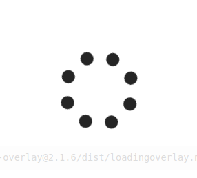
这篇介绍一个jQuery的插件(plugin),功能是在下载文件或资料时,在萤幕或区块中显示遮罩(overlay);遮罩中可以有动画或讯息,告诉使用者流览器正在进行下载,电脑没有挂掉,也没有在偷懒。网路上有很多类似功能的插件,个人觉得这个最简单,用起来也方便;但这个插件只能用在有支援CSS3的流览器上。插件的下载点和详细说明可以gasparesganga.com/labs/jquery-loading-overlay/网址中找到。
这个插件的遮罩可以遮蔽整个流览器的萤幕,或只遮蔽指定的元件;在遮蔽元件时,萤幕上可以有多个遮罩同时存在。当遮蔽的元件改变尺寸时,遮罩也会跟着改变尺寸。显示的动画可以替换或自订,或使用Font Awesome里的图像,如果要使用Font Awesome里的图像,要记得在网页中包含Font Awesome的样式表。插件只有三个函式,但函式名称并没有遵照一般的命名规范,第一个字母小写,后继再用驼峰式(camel case),这点要留意:
-
Methods 方法
$.LoadingOverlaySetup(options) 这个函式用来设定遮罩整体的各项属性,透过这个函式设定的属性会适用于所有后继产生的遮罩。在随后有各项属性作用的介绍。
- $.LoadingOverlay(action [,options]) 设定全萤幕遮罩。action 参数有两个字串值: “show” 显示全萤幕的遮罩,”hide” 则取消全萤幕遮罩。options 属性为选项参数,设定的属性只会适用于这次函式所产生的遮罩。
- $(selector).LoadingOverlay(action [,options]) 设定指定元件的遮罩。selector 的语法和CSS3 的选取器相容。action 和options 参数的用法和上述函式相同。
options 选项
options 的属性如下:
- color
- 预设值为”rgba(255, 255, 255, 0.8)”。赋予值设定遮罩的颜色及透明度。
- custom
- 预设值为””。赋予值可以是一个DOM 元件或jQuery 物件,这个物件会出现在遮罩的上面。设定为”” (空字串)或false 值时,此属性无作用。
- fade
- 预设值为true,淡入历时400 ms, 淡出历时200ms。赋予值设定淡入(fadeIn) 及淡出(fadeOut) 所经历的时间。只赋予一个数值时,单位为ms;淡入及淡出的时间都等于该数值。赋予一个数值阵列时,第一个阵列数值为淡入的历时,第二个数值为淡出的历时;例如:[400, 200]。赋予值也可为字串”fast” (200ms) 或”slow” (400ms)。赋予值为0 或false 时,此属性无作用。
- fontawesome
- 预设值为””。赋予值为Font Awesome 中图像的CSS 类别名,指定所要使用的图像。赋予值为”” 或false 时,此属性无作用。
- image
- 预设值为”loading.gif”。赋予值为遮罩上动画档案的所在位置。赋予值为”” 或false 时,不使用动画。
- maxSize
- 预设值为”100px”。赋予值为数值或字串,设定动画或图像的最大尺寸,单位为px。赋予值为0 或false 时,没有限制最大尺寸。
- minSzie
- 预设值为”20px”。赋予值为数值或字串,设定动画或图像的最大尺寸,单位为px。赋予值为0 或false 时,没有限制最小尺寸
- resizeInterval
- 预设值为0。赋予值为数值,单位为ms。赋予值设定当被遮蔽元件改变其尺寸时,对应遮罩改变尺寸的历时。只有在元件被遮罩遮蔽时,同时会改变其尺寸时,才会用到这个设定。
- size
- 预设值为”50%”。赋予值为数值,单位为%,用来调整遮罩动画或图像的尺寸,遮罩动画或图像的大小不会受到元件尺寸的限制,但会所限于maxSize 及minSize 所设定的值。赋予值为0 或false 时,此属性无作用。
范例
范例中产生三个遮罩,一个全萤幕的遮罩,两个元件遮罩,两个元件遮罩会同时出现在萤幕上。每隔3 秒执行一个动作,直到最终的萤幕出现。出现全萤幕遮罩前,会先看到最终的萤幕出现一下。如果要解决这个问题,可以把显示全萤幕的javascript 程式码移到<body> 的下方。图片中所展示的是当两个元件遮罩同时出现在萤幕的情况。

CSS
    html {
        width: 100%;
        height: 100%;
        background-color: white;
    }
    body {
        margin: 0 auto;
        width: 960px;
        height: 100%;
        padding: 20px;
        background-color: antiquewhite;
    }
    .area {
        box-sizing: border-box;
        margin: 20px;
        width:100px;
        height:100px;
        border: 1px solid black;
        float: left;
    }
    .coral {
        background-color: coral;
    }
    .lightgreen {
        background-color: lightgreen;
    }
.area{} 设定两个区块的共通属性。.coral{} 及.lightgreen{} 各设定两个区块的颜色。
HTML
<body>
    <div id="area_1" class="area coral"></div>
    <div id="area_2" class="area lightgreen"></div>
</body>
Script
<script>
$(function(){
    $.LoadingOverlaySetup({
        image: "../images/loading.gif",
        color: "rgb(238, 238, 238, 1)",
        // custom: $("<div>", {text: "Loading..."}),
        maxSize: "50px",
        minSize: "20px"

    });
    $.LoadingOverlay("show");

    // Hide it after 3 seconds
    setTimeout(function(){
        $.LoadingOverlay("hide");
        setTimeout(function(){
            $("#area_1").LoadingOverlay("show", {size: 10});
            $("#area_2").LoadingOverlay("show", {color: "rgb(238, 238, 238, 0.5)"});
            setTimeout(function(){
                $("#area_1").LoadingOverlay("hide");
                $("#area_2").LoadingOverlay("hide");
            }, 3000);
        }, 3000);
    }, 3000);
});
</script>
第3~10行,先设定遮罩的整体属性值。
第17行,设定#area_1区块的动画缩小为原来的10%。size的值可以赋予10或”10%”。
第18行,设定#area_2区块的遮罩透明度为0.5,颜色不变。
Actions 动作
The $.LoadingOverlay() and $(selector).LoadingOverlay() methods have five variants, corresponding to five Actions:
Show 显示
$[(selector)].LoadingOverlay("show" [,options])
Shows a LoadingOverlay, or increases the counter if it’s been already shown. Optionally you can pass a set of options, but note that they only take effect if the LoadingOverlay has not been shown yet on the element.
Hide 隐藏
$[(selector)].LoadingOverlay("hide" [,force])
Hides the LoadingOverlay or decreases the counter if it’s higher than 1. You can optionally pass a boolean parameter force to hide the LoadingOverlay even if the counter hasn’t reached 0.
Resize 调整大小
$[(selector)].LoadingOverlay("resize")
Force LoadingOverlay resizing. This is especially useful when you decide to disable the auto resize feature and you want to manually control it when you page changes.
Text 文本
$[(selector)].LoadingOverlay("text", value)
Update the text currently shown with the one passed to the value parameter. Pass boolean value false to hide the text element.
Note that this action only works if LoadingOverlay was initialized with some text.
Progress 进程
$[(selector)].LoadingOverlay("progress", value)
Update the progress bar with the value parameter. Pass boolean value false to hide the progress bar.
Note that this action only works if LoadingOverlay was initialized with progress option set to true.
Options and defaults values 选项和默认值
// Background
background              : "rgba(255, 255, 255, 0.8)"        // String
backgroundClass         : ""                                // String/Boolean
// Image
image                   : "<svg> ... </svg>"                // String/Boolean
imageAnimation          : "2000ms rotate_right"             // String/Boolean
imageAutoResize         : true                              // Boolean
imageResizeFactor       : 1                                 // Float
imageColor              : "#202020"                         // String/Array/Boolean
imageClass              : ""                                // String/Boolean
imageOrder              : 1                                 // Integer
// Font Awesome
fontawesome             : ""                                // String/Boolean
fontawesomeAnimation    : ""                                // String/Boolean
fontawesomeAutoResize   : true                              // Boolean
fontawesomeResizeFactor : 1                                 // Float
fontawesomeColor        : "#202020"                         // String/Boolean
fontawesomeOrder        : 2                                 // Integer
// Custom
custom                  : ""                                // String/DOM Element/jQuery Object/Boolean
customAnimation         : ""                                // String/Boolean
customAutoResize        : true                              // Boolean
customResizeFactor      : 1                                 // Float
customOrder             : 3                                 // Integer
// Text
text                    : ""                                // String/Boolean
textAnimation           : ""                                // String/Boolean
textAutoResize          : true                              // Boolean
textResizeFactor        : 0.5                               // Float
textColor               : "#202020"                         // String/Boolean
textClass               : ""                                // String/Boolean
textOrder               : 4                                 // Integer
// Progress
progress                : false                             // Boolean
progressAutoResize      : true                              // Boolean
progressResizeFactor    : 0.25                              // Float
progressColor           : "#a0a0a0"                         // String/Boolean
progressClass           : ""                                // String/Boolean
progressOrder           : 5                                 // Integer
progressFixedPosition   : ""                                // String/Boolean
progressSpeed           : 200                               // Integer
progressMin             : 0                                 // Float
progressMax             : 100                               // Float
// Sizing
size                    : 50                                // Float/String/Boolean
minSize                 : 20                                // Integer/String
maxSize                 : 120                               // Integer/String
// Misc
direction               : "column"                          // String
fade                    : [400, 200]                        // Array/Boolean/Integer/String
resizeInterval          : 50                                // Integer
zIndex                  : 2147483647                        // Integer
background
Overlay’s CSS background-color property. Use rgba() to set the opacity. Keep in mind that if backgroundClass is provided then background option is ignored.
backgroundClass
Sets a custom CSS class for the background. Use an empty string "" or false to disable it. Keep in mind that if backgroundClass is provided then background option is ignored.
image
URL or inline representation of the image to show. It supports both raster images and vectorial SVGs. You can pass an inline SVG, a path to a file or even use a base64-encoded image or SVG (e.g. "data:image/png;base64,..."). Set to an empty string "" or false to show no image.
imageAnimation
Controls the animation of the image element. See animations.
imageAutoResize
Controls the auto resizing of the image element. Set to false to disable it.
imageResizeFactor
Controls the proportion between the image element and the size parameter.
imageColor
Image fill and stroke colors. This setting has effect only on SVG images and will be useless with raster images (JPG, PNG, GIF, etc.). Use a single string value to specify only the fill color, or a two-elements array to set fill and stroke respectively. You can use any CSS valid expression, included rgba(). Use an empty string "", empty array [] or false to leave them unspecified. Note that if imageClass is provided then imageColor is ignored.
imageClass
Sets a custom CSS class for the image element. Use an empty string "" or false to disable it. Note that if imageClass is provided then imageColor is ignored.
imageOrder
Sets the order of the image element relative to the others.
fontawesome
Class(es) of the Font Awesome icon to use. Note that you must include Font Awesome in your project if you wish to use this feature. Use an empty string "" or false to disable the feature.
fontawesomeAnimation
You can rely on Font Awesome native classes to animate the icon (e.g. fa-spin or fa-pulse) and pass them directly to fontawesome option, but of course you can also enjoy the full power of LoadingOverlay animations as with any other element type. See animations for details.
fontawesomeAutoResize
Controls the auto resizing of the fontawesome element. Set to false to disable it.
fontawesomeResizeFactor
Controls the proportion between the fontawesome element and the size parameter.
fontawesomeColor
Sets the color of the fontawesome element. You can use any CSS valid expression, included rgba(). Use an empty string "" or false to leave it unspecified.
fontawesomeOrder
Sets the order of the fontawesome element relative to the others.
custom
A DOM element, jQuery object or plain HTML to append to the LoadingOverlay. Use an empty string "" or false to disable the feature.
customAnimation
Controls the animation of the custom element. See animations.
customAutoResize
Controls the auto resizing of the custom element. Set to false to disable it.
customResizeFactor
Controls the proportion between the custom element and the size parameter.
customOrder
Sets the order of the custom element relative to the others.
text
Displays a text element in the LoadingOverlay. Use an empty string "" or false to disable the feature.
textAnimation
Controls the animation of the text element. See animations.
textAutoResize
Controls the auto resizing of the text element. Set to false to disable it.
textResizeFactor
Controls the proportion between the text element and the size parameter.
textColor
Sets the color of the text element. You can use any CSS valid expression, included rgba(). Use an empty string "" or false to leave it unspecified. Note that if textClass is provided then textColor is ignored.
textClass
Sets a custom CSS class for the text element. Use an empty string "" or false to disable it. Note that if textClass is provided then textColor is ignored.
textOrder
Sets the order of the text element relative to the others.
progress
Displays a progress bar element in the LoadingOverlay. Use false to disable the feature.
progressAutoResize
Controls the auto resizing of the progress element. Set to false to disable it.
progressResizeFactor
Controls the proportion between the progress element and the size parameter.
progressColor
Sets the color of the progress element. You can use any CSS valid expression, included rgba(). Use an empty string "" or false to leave it unspecified. Note that if progressClass is provided then progressColor is ignored.
progressClass
Sets a custom CSS class for the progress element. Use an empty string "" or false to disable it. Note that if progressClass is provided then progressColor is ignored.
progressOrder
Sets the order of the progress element relative to the others.
progressFixedPosition
Set a fixed position for the progress element. It accepts a space-separated string with position and optional margin.
Position value can be either top or bottom while optional margin can be expressed in any CSS unit.
Note that enabling this option will take the progress element out of the order flow and progressOrder will be ignored.
Example values: "top", "bottom", "top 20px", "10% top", "5rem bottom", "bottom 2vh", etc.
progressSpeed
Controls the animation speed in milliseconds of the progress bar when its value is updated. Set to 0 to disable smooth animation.
progressMin
Sets the minimum value for the progress element.
progressMax
Sets the maximum value for the progress element.
size
Size of elements expressed in percentage relative to the LoadingOverlay size. Note that the computed value will be constrained between minSize and maxSize. You can specify a fixed size expressed in any CSS unit passing a string (options minSize and maxSize will be ignored in this case).
Each element will then be resized according to the computed value and its Resize Factor.
Use 0 or false if you wish to fully control the size of the elements via custom classes.
minSize
Minimun size of elements in pixels. Set it to 0 or false for no limit.
maxSize
Maximun size of elements in pixels. Set it to 0 or false for no limit.
direction
Sets the arrangement of the elements in the LoadingOverlay. It can be "column" or "row".
fade
Controls the fade in and fade out durations, expressed in milliseconds. Use 0 or false to disable it (meaning a zero duration), an integer or string to set equal fade in and fade out times or a two-elements array to set respectively fade in and fade out durations (e.g. [600, 300]). Boolean value true will be treated like default value [400, 200].
resizeInterval
Specifies an interval in milliseconds to resize and reposition the LoadingOverlay according to its container. This is useful when the container element changes size and/or position while the LoadingOverlay is being shown. Set it to 0 or false to disable this feature.
zIndex
Use this to explicitly set a z-index for the overlay. This is useful when LoadingOverlay is used with other z-index intensive libraries like Bootstrap.
本文:jQuery插件:带遮罩无限循环loading加载动画插件, jQuery LoadingOverlay
Related Posts

Bootstrap 3: 菜单居中 Center content in responsive bootstrap navbar

七步从AngularJS菜鸟到专家(4和5):指令和表达式
如何优化网页转化率?(中篇)
About Author